Week 1
This week we were given the Zine brief, this was to create a zine on a journey, place or an interview and then to pick a theme. I have chosen my theme to be on bikes. This is because I have been in Amsterdam for this week and Amsterdam has a lot of different types of bikes. This gave me a great opportunity to gather primary research.

I thought that a strength with this primary research was that I gathered a lot of different shapes, materials and colours bikes. This will mean that for my drawings there will be a lot more sources that I can use to inspire and inform my illustrations. However a weakness is that because my primary research is just photos they don't convey the movements of bike that well, a way that I could have improved my recording my research could have been though short video clips to capture the movement and sound, so that it could remind me of the experience. Which then would have an positive impact on my drawings.

When I came back from Amsterdam I then did secondary research, I looked into the history of bikes, facts about bikes, bike quotes, bike parts and vintage bikes.
I thought that a strength with my secondary research was that I did a lot of in depth research on my specific theme which meant that I really understand what I am going to drawing and I am started to understand the target audience that ride bikes. This will have a positive impact on my project later on because it means that I can design to match their needs and wants.
However reflecting back on this week, I think that a weakness is that I needed to look at other sources. I only used Google, this would have enriched my project if I had looked a books or magazines. I have learnt for later on in this project is too use a wide range of sources.
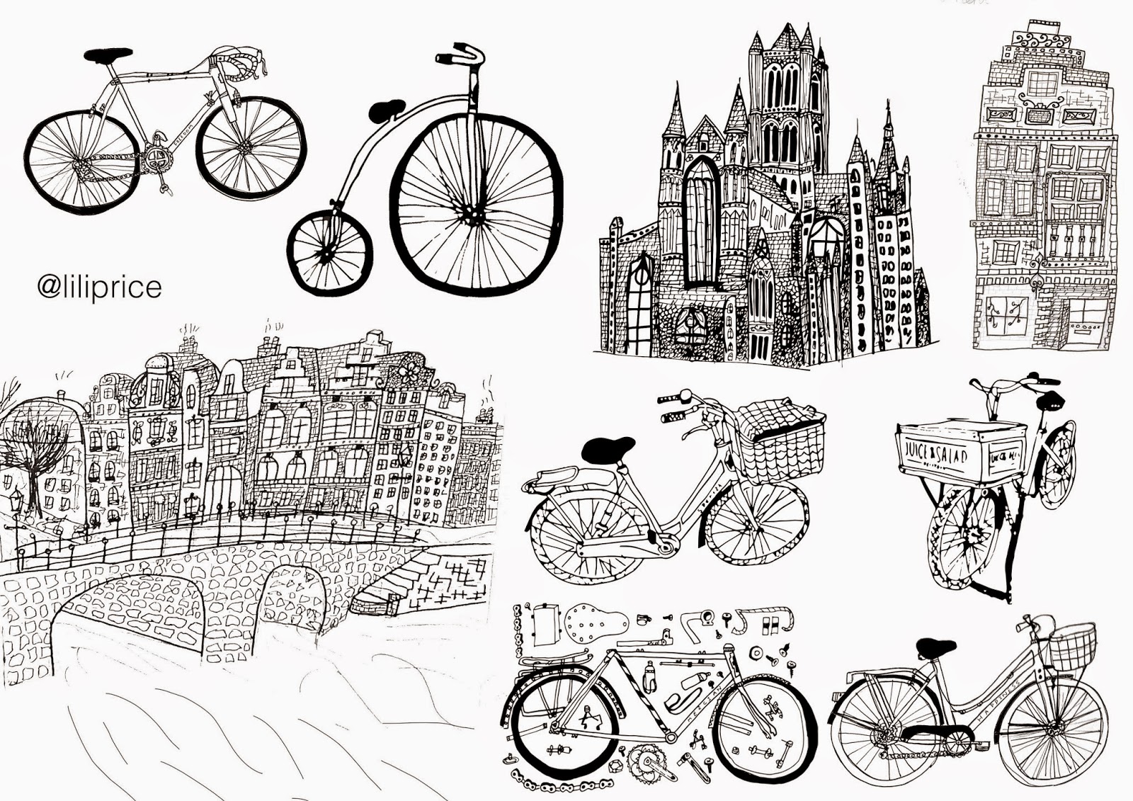
These are my line drawing responses from the primary and secondary research. I think that a weakness is that I should have used more different line weights and should have tried some different techniques and drawing styles. This would have given me options for further on in the project to pick from and play with.

Just before I went to Amsterdam I did a photo shoot with bike chain so that I could make my own type face. I thought that a weakness was that I should have had better lighting because it made the quality of some of the letter forms, not that clear, which means that the impact would be that if it was used, it could be very unprofessional and not very legible, which might put off a potential viewer from understand the information that is trying to be conveyed. I also think that I should have used a better grid structure for this in my sketchbook because not all the letter forms are the same size, some are also not straight.

When I was in Amsterdam I made up a type face of letter forms from my primary research.
At the end of the this week, I decided to write up a statement of intent. This was so that I could get my idea clear and straight in my mind. This is a strength because it will give me a clear direction for where my project is going.
Week 2
This week I will be focusing on taking my line drawings further and taking them digital.

These are taken into photoshop and illustrator. I have used different tools and techniques to produces these. I think that an strength is that I have brought another dimension to the line drawings. They look more interesting, the impact this will have is that is will catch the attention of the target audience, it also conveys the message in a more better way. However to improve these future I would have played around with different colour pallets.

I then started to build patterns up with the bikes that I had. I thought that these are visually appealing to look at however I felt that they didn't have a meaning or message that it was trying to communicate. I thought that these would be good as a branding element to a business, such as wrapping paper, to identify a business.

This pieces of work is James Gulliver Hancock. This has inspired my piece below by laying bikes on top of each other at different angles. I think that his illustration are very free hand, the lines are not straight and perfect, this has influences some of my drawing to be slightly lose.

This piece of work was inspired by James Gulliver Hancock. I think that a strength with this is that it uses a limited colour pallet so that it is not too complicated to look at. The impact that this would have is that the viewer would be able to under stand the illustration faster.

For this project I have made a business up called Charles Oscar Bicycles, this is so that I can have a business in mind that I design for and think about what, who, their brand and the message they are trying to get across to their target audience. I like to do this, so that their is a purpose in why I am designing and to also try and learn for designing for business and clients, so later on in life when I have professional clients it is 1st nature to be thinking about what the client and their target audience needs and wants are. It also gives my project a direction and context for my work, to fit into really life.
This project is not about branding, so I haven't gone into a lot of depth on logo and branding work like the depth i went into for Dartmouth sailing club branding project . I thought about initial ideas and used my illustration that i did in the pervious week. I think that all these logos are very basic they are not over complicated, there is not a wide range of initial ideas, If I had more time for this project I would have loved to have spent more time of this section, by looking at different layouts, more drawings, different typefaces and hand drawn typography. This would have given me a wider range of styles of logos to then refine.

I then went on to refine the logo, I played with line weight, adding illustration. I then looked at brand colour and how it might look on a letter head. I would have defiantly liked to have gone into a lot more refinement of this logo, I would have broken it down by looking at the shape of it, then looking at the type and final the illustration. I would have explored all the areas in great detail.
I thought that my final logo looked well composed. Even though I didn't spend as much time as I would have liked I am happy with how it turned out, I like how the circle represents the bike wheel. I then think that the use of 2 typeface goes well together. I feel that this this logo represent Charles Oscar Bicycles.

I experimented with mono printing this week. I did my logo as a mono print I was very happy how it came out, it looked very vintage and gave it a lovely feel. However I think that it is a little too strong my my brand I wanted the work to look a little bit modern with a touch of vintage. How I am going to do this is by using the texture of the mono prints and putting them over my work in photoshop.

This is my final branding for business that I have created.
Week 3
This week I wanted to start focusing on the layout of the pages, and bring type in with the the drawings and patterns. Also I wanted to start thinking on how the actual book layout will be. 

These are two typography poster that I have design, this is the first time that I have ever used illustrator to design typography posters.

I have decide that for my zine, I want to deign a look book, this would be to sell vintage road bikes to target audience that Charles Oscar Bicycles would have. This would be a combination of photos, illustration and typography.
I did my first photo shoot this week for this project. I wanted to get a vintage, indie type feel to the photos. The photos came out very dark, I edited them to black and white to give them that urban, indie vintage feel.

Next I looked over the photos I had and decided to take my skills further by trying the new skills I learnt on illustrator, with typography by trying out type on top of the photos. I think that a strength with this is that the type face is white, this makes it stand out and draws attention from the dark background. However I feel that there is too much negative space between the lines. A way that I was going to improve it is that I am going to use the warp tool so that the type will fit together, so that It will still read easily.

I then went further and started to develop more type around the images.

At the end of the week I started to look at layouts of books, zines and book art. This was inspired by Sue Black Well, I found this flower book in a charity shop and I stuck them on top of the book, to create a garden book. To develop this future I would have got dried mud and placed them on the book.
Week 3
This week was all about development of the page spreads, and the decisions about how to bind the book and present it. At the end of the week I will also have a group crit where other members of my class will look over my work and give there feedback. Also I will be giving feedback on other people work.

For inspiration for my layouts for my book, I looked a catalogues, I thought that this was the most appropriate because I am designing a catalogue to sell bikes. The 2 examples of catalogues that I have picked are Anthropology christmas guide and Falmouth Uni Guide.
Anthropology has inspired my work by having a full bleed photo on one side of the page and then use a grid structure to layout photos with lots of negative space. Falmouth Uni Guide influenced my work by having full bleed photos covering 2 pages

To design the layout of the book, I used indesign, this allowed me to use gridlines, it also allowed me to edit and update content, with out importing all content again, with slight changes.
the page above shows my development, I first wanted a full bleed of the type with a small image of the other side, I decided that this did work and it was not easy for the eye to look at. This then lead me to to replace the image with an image that went over half of the page. This then gave a rectangle of white blank negative space. In this area, I played around with images in grid structure, in black and white and then combined my hand drawn illustration with it.

For this week, I looked over the photos that I had a decide that I needed a couple more. This meant that I went did another photo shoot. I also needed to do a product shoot, so that it can show the life style of the people who might buy the bikes.

The main problem that I had was that I was not allowed into the photography studio to do a bird eye shot. To fix this problem I thought I would shoot the products instead on a wooden floors in my bed room. This was very hard because I couldn't get high enough to get a bird eye view. This meant that the photos I have got are not from the perfect bird eye view. Also standing on chairs trying to get these photos was really hard.
Final Book


This is the first time that I have used photography and typography as the main focus of the project. It is normally illustration with some type. This has been a big learning curve for me and I have developed massively. I have leant how to set up a photo shoot, how to use illustrator and how to edit photos.
I think that a strength with my book is that it met the client brief which was to create a catalogue which conveyed the life style of their target audience. I this did this by using photography as my main point of focus, this is because if I used illustration for the whole of it, it wouldn't have conveyed the lifestyle as well as the photography, because it looks more real. I am very happy with how all the photos came out. I used brown kraft paper which i was a bit worried about, with the photos being printed onto. I think that the photos came up really clear. The impact was that it gave a vintage effect to the work.
However I think that a weakness in my project was that I should get a proof reader to check it, because their a couple of spelling mistakes, which means that I have to edit them and print it out for the main deadline. The impact with spelling is that it makes the catalogue look unprofessional and might put the target audience off buying the product, because they might lose the trust in the brand. Also another weakness in my project was that because I printed on brown kraft paper, it caused a lot of problem though out the whole book, from binding to bleeds. I tried fixing the most of the problems however the paper was on manual feed, which means that the pages where printed in slightly different places to each of the other pages, this meant that the book does align properly and that in the middle it doesn't match up. The impact with this is that it not that clean high end product that i really wanted, there very little bits which just make it look unprofessional. The impact might put the target audience off buying the product because they lose trust in the brand.


